Category Archives: Visualisations

When Less is More

Recently Transport for London introduced a new version of their underground map to depict the Night Tube service that commences in September 2015.  In this fast paced, constantly evolving, modern technology driven city, it is a pleasure to see we are still using the same beautiful visualisation that was invented by Harry Beck over 80 years ago.  Beck recognised that it was far more important for the map to clearly illustrate the connections between tube stations rather than get lost in the true geographic detail.  His innovative idea is a very good example of how sometimes “less is more”.

Amethyst_blog_Jun15_image

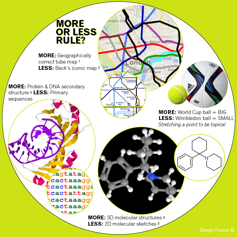
The geographically correct version of the tube map (obtained via Google Maps) is shown above alongside of Transport for London’s map.  Both are useful and informative in their own right.  When planning my next underground trip Beck’s representation is a clear preference.  However, if the sun was shining and I wanted to walk part of my journey then I would head to Google Maps.

In science we often use the “less is more” approach to clearly and concisely communicate chemical structures to one another.  We flatten out the 3D geometry.  We don’t label every carbon, explicitly draw every hydrogen atom or get our rulers out to draw bond lengths to scale.  However, when modelling how a molecule interacts with a biological target then accuracy of 3D shape and charge distributions will be required.  Proteins and DNA are also represented with varying levels of information. Simple strings of letters are used when hunting for patterns in gene sequences, whilst a more detailed view of how proteins unravel DNA helps us understand how our genes are activated.

“Less is more” can also apply to machine learning.  With the era of big data upon us we have access to larger and larger data sets and may get tempted to use as much data as possible to build models.  However, using every single variable we can get our hands on runs the risk of producing over-fitted biased models that make poor predictions.

The longevity of Harry Beck’s underground map is a reminder of the importance of the “less is more” approach.  Visualisations can sometimes be made more powerful by stripping out information to focus on answering specific questions.

I could continue, but less might encourage you to come back for more.

REFERENCES

1. Geographically correct tube map from Google Maps
2. Beck’s iconic tube map
3. TBP/TATA-box complex from Kim et al 1993 Nature 365:512-520 (Protein Data Bank Entry 1YTB)
4. 3D structure of Phencyclidine obtained from ChemSpider
5. 2D structure of Phencyclidine sketched using ChemDoodle’s 2D Sketcher

Guardian Masterclasses Data Visualisation

Great class and opportunity to learn from the experts.  Housed in the creatively designed London offices of the Guardian.  A great set of hand-outs, excellent material and interactive group tasks that get you talking to people across industries.

Why not book a place now?  Next two advertised slots are the 14th March 2015 and 11th April 2015

I attended this course last year and would strongly recommend it to anyone wanting to learn more about infographics regardless of what sector you come from.  The room was filled with an exhilarating mix of developers, journalists, writers, graphic designers and researchers – an inspiring infusion of creatives, techies and academics.

The day including interesting discussions around the contrasting approaches of Edward Tufte and David McCandless.  Being a scientist I am naturally drawn towards the evidence based approach of Tufte, however I am equally drawn towards the exciting visuals of McCandless.

Dynamic Visualisations Part 1

Take a look at this video snippet from BBC Four’s archives of Hans Rosling presenting his dynamic graph of the world showing how 200 countries have changed over 200 years.

“having the data is not enough, have to show it in ways people both enjoy and understand”  Hans Rosling

Gapminder is available online or can be downloaded.  It shows how 5 dimensions can be clearly viewed via a 2 dimensional plot that uses colour, size and time to represent an additional 3 dimensions.

dynamicGraphCartoon

Wherever we have time as a static dimension on a graph, we should question whether it is worth representing time by time itself to free up a dimension and create a richer dynamic representation.  There will of course be scenarios when we want static 2D plots and when video representations may not be appropriate.  However, in a technology driven world with an increasing number of papers and books being read on electronic devices, it may become second nature for us to expect to be able to press play to see any time-based visualisations move.


Lead Optimisation Funnel Diagrams

VISUAL AID TO PROCESS IMPROVEMENT, REALISTIC GOAL SETTING AND RESOURCE MANAGEMENT

This article discusses how Funnel Diagrams can be used to make a positive impact on your lead optimisation projects.

Topics include: spotting process bottlenecks, confirming the successful impact of process changes, gaining insights into how achievable a goal is, taking a glance at how resources are split across multiple projects and assessing resource needs.

Two example lead optimisation projects that are at different stages are used to illustrate the funnel applications. An error bar extension to the original visualisation is presented.

Hirons L. Chemistry Today, August 2012, 30(4), 24 – 26

Funnel Diagram for project A:

Figure1

Funnel Diagram for project B with Assay 1 error bars:

Figure2

Novel Funnel Diagrams Published in Drug Discovery World

funnelThis article introduces Funnel Diagrams as a novel way of simultaneously viewing both attrition and time – two important factors to consider when applying process
improvement to drug discovery.

Hirons L, Johnstone C, Sambrook-Smith C. Drug Discovery World Winter 2011/12, 13(1), 44 – 49

A single funnel is shown to the right. Each rectangle represents an event. Rectangle width
represents the number of compounds processed by that event. The distance between a rectangle
and the top of the funnel represents the average number of days from compound registration to completion.

Attrition is therefore represented by changes in a funnel’s width and time by elongation of a funnel

Below is a funnel diagram that gives a six-month snapshot of a lead optimisation project. Each funnel represents a month
with a trellis of 6 funnels giving a summary of how processes are changing.

funnelDiagram

Highlights from the above diagram:

  • Changes in the number of new compounds can be seen by glancing across the red rectangles. The sudden change between
    May and June relates to the addition of chemistry resource.
  • In July the funnel folded back upon itself indicating an unexpected order of events
  • Assays 1 and 2 are consistently completed within a week of compound registration, regardless of the volume of requests – indicating a minimal impact area for process improvements
  • Variable timelines are seen for Assay 3, independent of throughput – an area to examine further