Take a look at this video snippet from BBC Four’s archives of Hans Rosling presenting his dynamic graph of the world showing how 200 countries have changed over 200 years.
“having the data is not enough, have to show it in ways people both enjoy and understand” Hans Rosling
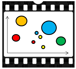
Gapminder is available online or can be downloaded. It shows how 5 dimensions can be clearly viewed via a 2 dimensional plot that uses colour, size and time to represent an additional 3 dimensions.
Wherever we have time as a static dimension on a graph, we should question whether it is worth representing time by time itself to free up a dimension and create a richer dynamic representation. There will of course be scenarios when we want static 2D plots and when video representations may not be appropriate. However, in a technology driven world with an increasing number of papers and books being read on electronic devices, it may become second nature for us to expect to be able to press play to see any time-based visualisations move.