Recently Transport for London introduced a new version of their underground map to depict the Night Tube service that commences in September 2015. In this fast paced, constantly evolving, modern technology driven city, it is a pleasure to see we are still using the same beautiful visualisation that was invented by Harry Beck over 80 years ago. Beck recognised that it was far more important for the map to clearly illustrate the connections between tube stations rather than get lost in the true geographic detail. His innovative idea is a very good example of how sometimes “less is more”.
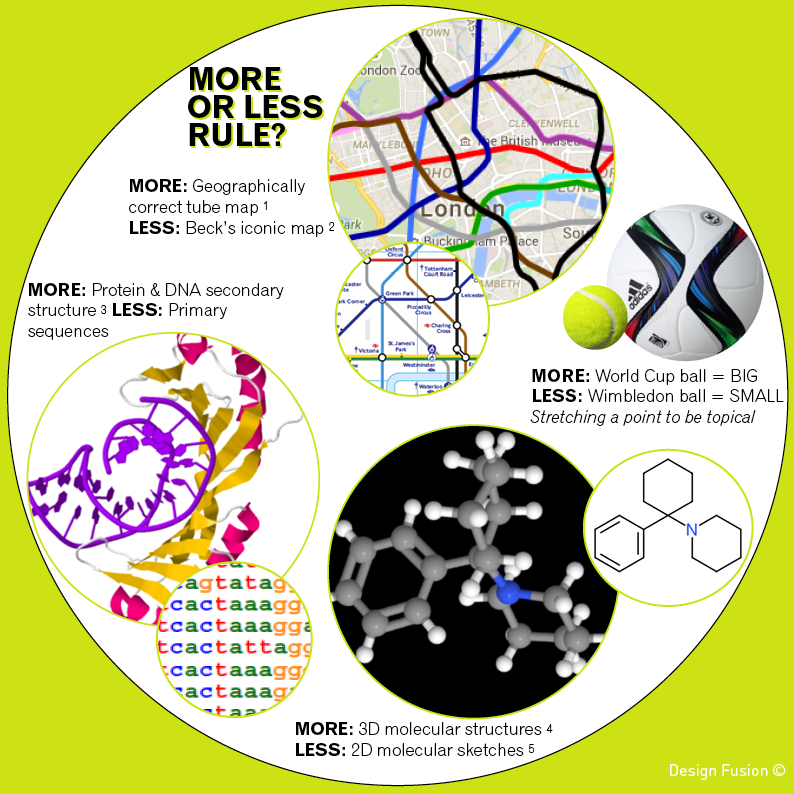
The geographically correct version of the tube map (obtained via Google Maps) is shown above alongside of Transport for London’s map. Both are useful and informative in their own right. When planning my next underground trip Beck’s representation is a clear preference. However, if the sun was shining and I wanted to walk part of my journey then I would head to Google Maps.
In science we often use the “less is more” approach to clearly and concisely communicate chemical structures to one another. We flatten out the 3D geometry. We don’t label every carbon, explicitly draw every hydrogen atom or get our rulers out to draw bond lengths to scale. However, when modelling how a molecule interacts with a biological target then accuracy of 3D shape and charge distributions will be required. Proteins and DNA are also represented with varying levels of information. Simple strings of letters are used when hunting for patterns in gene sequences, whilst a more detailed view of how proteins unravel DNA helps us understand how our genes are activated.
“Less is more” can also apply to machine learning. With the era of big data upon us we have access to larger and larger data sets and may get tempted to use as much data as possible to build models. However, using every single variable we can get our hands on runs the risk of producing over-fitted biased models that make poor predictions.
The longevity of Harry Beck’s underground map is a reminder of the importance of the “less is more” approach. Visualisations can sometimes be made more powerful by stripping out information to focus on answering specific questions.
I could continue, but less might encourage you to come back for more.
REFERENCES
1. Geographically correct tube map from Google Maps
2. Beck’s iconic tube map
3. TBP/TATA-box complex from Kim et al 1993 Nature 365:512-520 (Protein Data Bank Entry 1YTB)
4. 3D structure of Phencyclidine obtained from ChemSpider
5. 2D structure of Phencyclidine sketched using ChemDoodle’s 2D Sketcher
Hi there Amethyst. I remember this well when I was playing around with neural nets a lot. Add too many neurons and it was great at telling you what you already knew but the predictions were hopeless. The other interesting thing was that you could train them too much. If you curtailed the training, the predictions were usually better than if if let the training run on longer, whereas the error in the test set just got smaller and smaller. Definitely less is more there…
Neural nets seem to have fallen out of fashion these days (at least in chemistry applications) although there have been one or two more recent papers that may have got around some of these issues. I wait to see if they rise again in popularity to the levels we saw in the ’90s.
Hey Molmod, I like your “less is more” neural net thoughts. Do you think that the interpretability of a model might also be a factor in the choice of method used? I have found that some chemistry clients favour models that give them a meaningful reason to why a compound is being predicted as active.
I have just stumbled across this interesting blog article published last month about neural networks in image recognition. Has some really eye catching images of what you get when you take a peek inside a neural network. For example take a look at the magical animals that are found in the sky.
That’s definitely the case : an interpretable model can be much more useful. Linear regression models certainly win in that sense over NNs. However, sometimes the descriptors that go into such a model have an obscure relationship with molecular structure and give no real insight into how to optimise the activity of interest. I don’t think I’d dare ask a chemist to reduce his Balaban index for example.
I love the images generated by the Google NNs in your link. Particularly the one that sees animals in the pictures of clouds.